Hello heroes!
Marti has opened a Patreon account on 29 May 2021. You can now support him through this platform and keep up to date with any LF2 announcements.
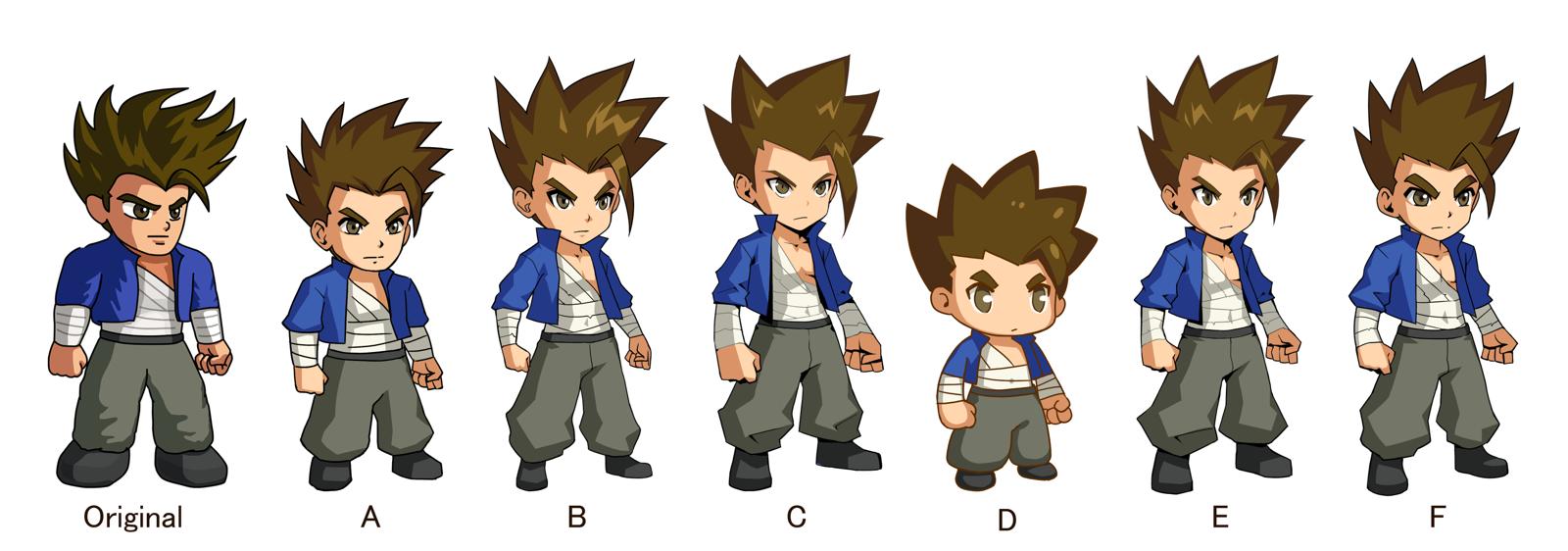
In order to make Little Fighter more attractive to new players (2000s and 2010s born generation), increasing its chances for a longer-term future, Marti has invited a professional artist, K. Chung , to redesign the LF2 character's style. You may vote for your favorite style here. Marti already has a preference in mind but he wants to see if the public accepts it.
If I may be so bold as to share my personal preference here, I believe that none of the options given by Marti are good enough. The original is too bland, lacking the quality detail of K. Chung's designs. However, none of the styles provided by K. Chung characterize the style that I believe LF2 fans yearn for in Little Fighter. The body is too thin and the facial style resembles modern anime too much, which lacks the depth, "tough guy" look and detail of the 80's and 90's anime style that we all admire. Saint Seiya, Berserk and Yu Yu Hakusho are good anime references.
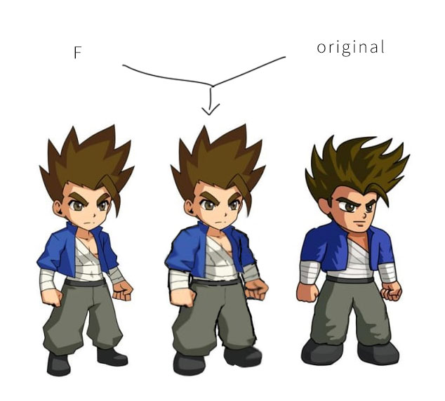
Hocti Ho, Marti's long time friend, has "fixed" the thin body problem of option F, the most voted one thus far. This one looks much more in sync with what I have in mind, but it is still not quite there.
Source: Facebook comment, Patreon comment
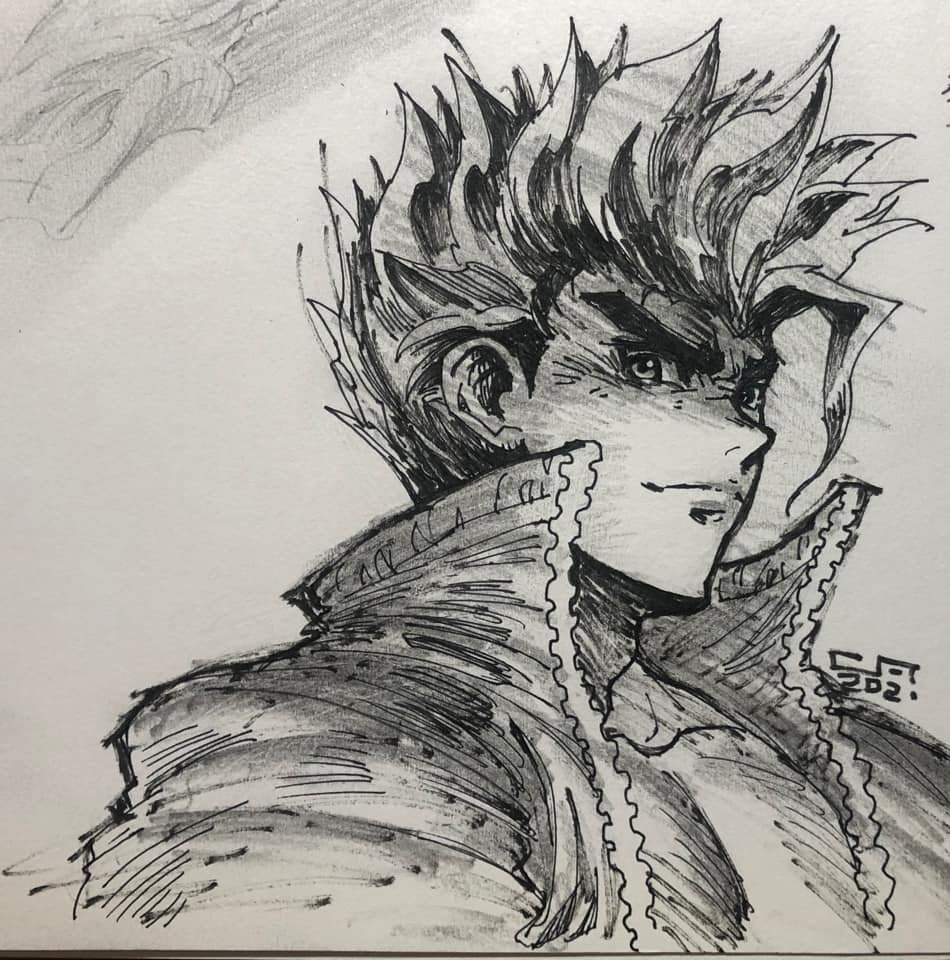
Now, Calive Fan has made an LF2 Davis fanart that I really like. This style resonates with the best animes from the 80's and 90's.
Source: Facebook comment
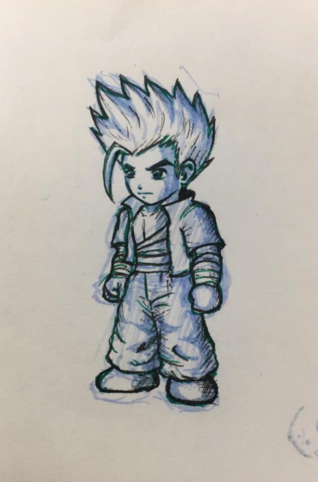
And finally, Fico Mok has made a much better design of what LF2 in-game Davis could look like (I especially like the eyes, hair and face in general).
Source: Facebook comment


